Case Study -
Horme Hardware
In this case study, we aim to create an improved eCommerce website, that will showcase their products while maintaining their brand image: “small shop” appeal and great customer service.

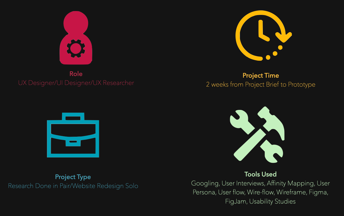
Role, Project Type, Project Time, Tools Used
Competitive vs Comparative
By conducting competitive analysis on local shops such as HardwareCity and UrbanWare, we can understand the offerings of the local market and what users are accustomed to seeing and doing. For comparative purposes, I have chosen two popular stores, Zalora and Ikea, to reuse some concepts and create familiarity when using the Horme website.
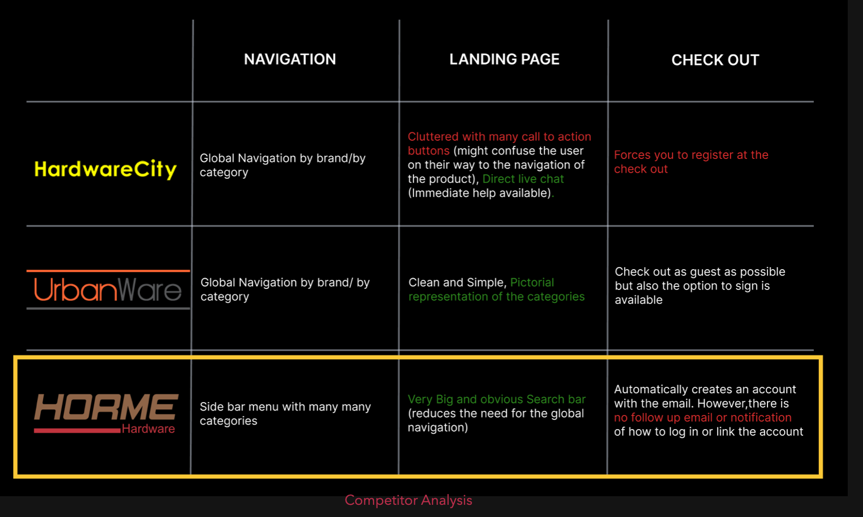
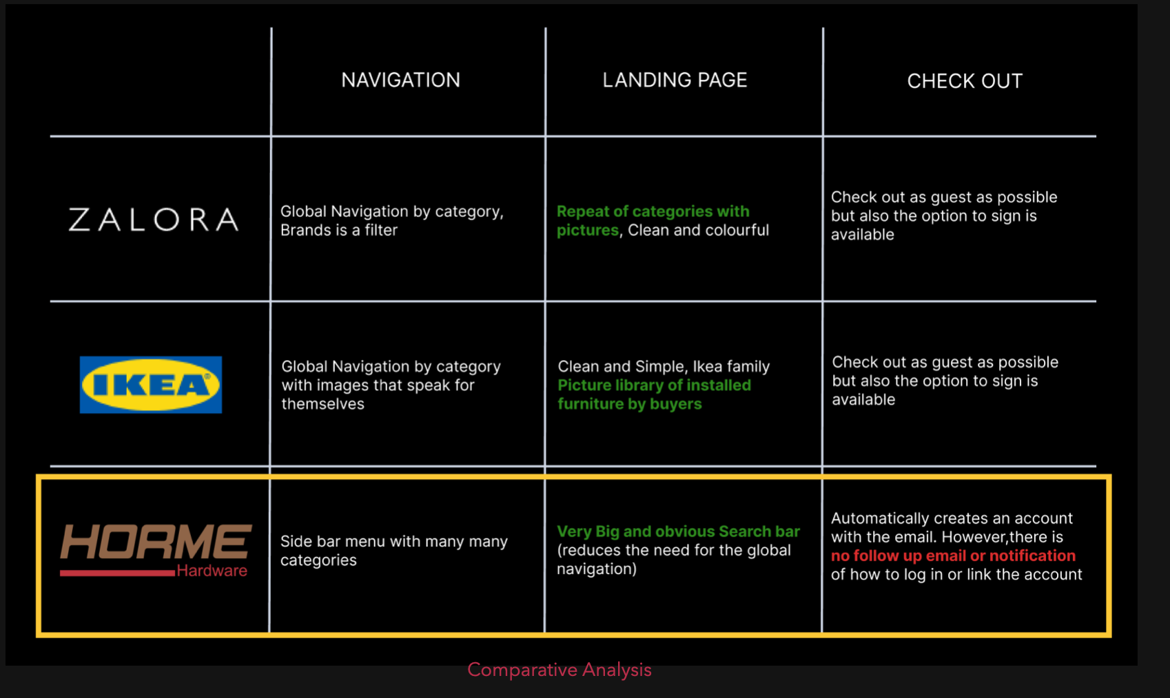
The navigation, landing page, and check out process are the key points that can make or break a user's purchasing decision.
To ensure that our clients stay ahead of their competitors, I conduct both comparative and competitive analyses of their websites. By using these three parameters as a basis of comparison, we can highlight the advantages and disadvantages of each feature.
I use a color-coding system to make the analysis easy to understand. Green highlights indicate features that offer significant advantages, while red highlights signify features that may hinder user experience.
This way, we can identify which elements need improvement and optimize them to provide the best possible experience for our clients' customers.
User Interviews

As a UX designer, I understand the value of gaining insights from user interviews to design products and services that meet their needs. I utilized this method to delve deeper into users' intentions and expectations. To achieve this, I crafted specific questions based on categories such as lifestyle, shopping habits, influence, delivery/pick-up, and customer service.
I conducted user interviews with four hardware shoppers who had specific needs. The shoppers were from different walks of life, and their ages ranged from 30 to 50 years old. Furthermore, their level of knowledge regarding hardware materials was also diverse.
Affinity Mapping & User Personas
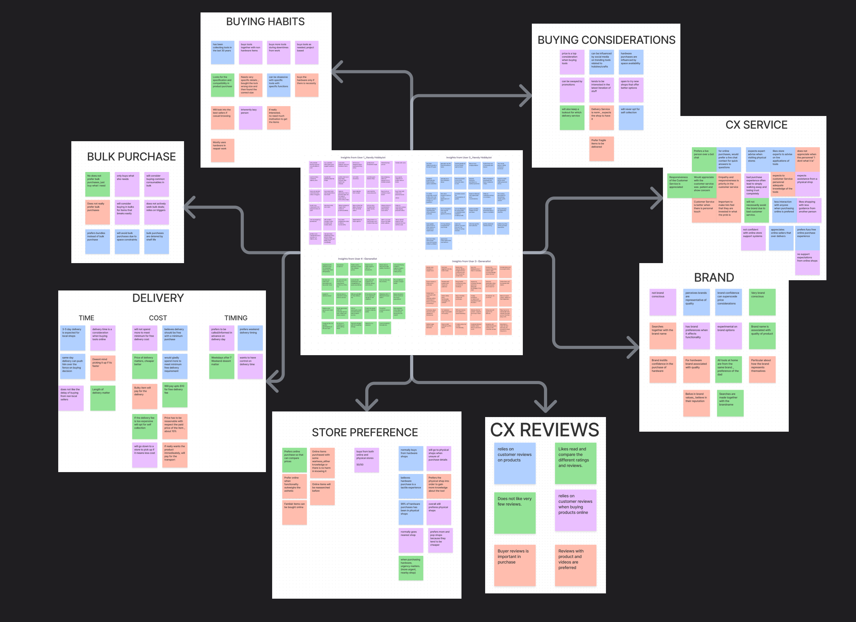
Through four user interviews, I was able to gather substantial data, which I then synthesized using an affinity mapping technique. This helped me identify common themes and groupings, allowing me to zoom in on key areas that needed attention.
Using the needs identified, we are able to create two personas who will able to guide us through the process of designing the website.
User Persona 1
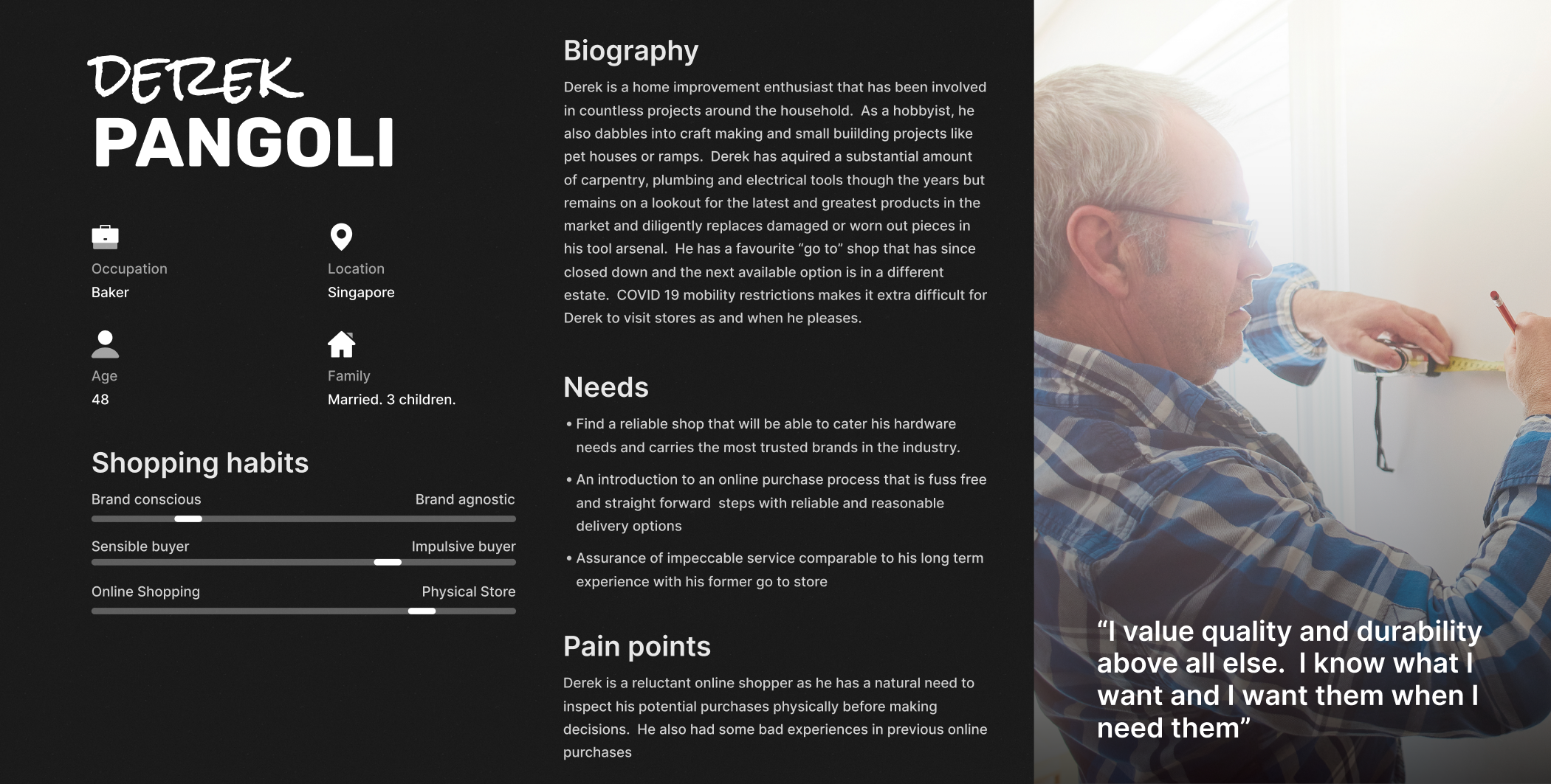
I created a persona named Derek Pangoli, representing a segment of users who prefer physical stores but occasionally shop online for hardware materials.
Derek has a good knowledge of hardware materials and is constantly looking for ways to improve their home based on what is available in the market.When shopping online, Derek is likely to zoom straight into the item they need and rely heavily on fellow customer reviews to gain confidence in their purchase. Therefore, it is essential to provide detailed product descriptions, customer reviews and ratings, and an easy-to-use search function to help Derek find what they need quickly and efficiently.
By understanding Derek's shopping behavior, I can design an e-commerce site that caters to their needs, providing a seamless user experience that is tailored to their preferences.
User Persona 2
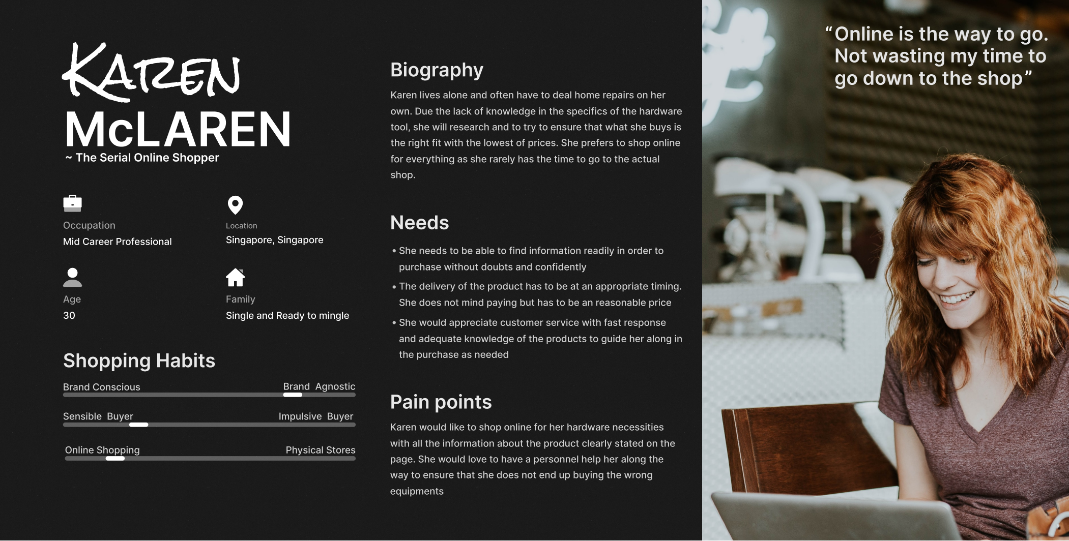
I created a persona named Karen McLaren, representing a segment of users who are online shoppers and not familiar with hardware materials and tools.
Karen may require more guidance in terms of assembly and usage of the tools, as they may have little knowledge of the technical details and terminology used for hardware materials.Providing clear and concise product descriptions, along with easy-to-follow instructions and tutorials, is essential to help guide Karen through the purchasing process and use of the product. Additionally, as someone who prefers online shopping, Karen does not want to waste time physically browsing in a shop.
Therefore, providing an easy-to-use search function and product filters can help them quickly find the products they need without any hassle.By understanding Karen's needs and preferences, I can design an e-commerce site that is user-friendly and easy to navigate for someone who is not familiar with hardware materials.
Problem Statement and HMW

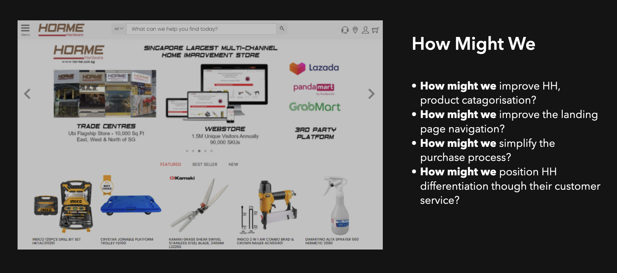
By defining a clear problem statement and using the "How might we" approach, we can create a more user-centric design that not only addresses the identified problem but also enhances the overall user experience of the website. This, in turn, can lead to increased customer satisfaction, loyalty, and business success for Horme Hardware.
Moving On To The Solution Design

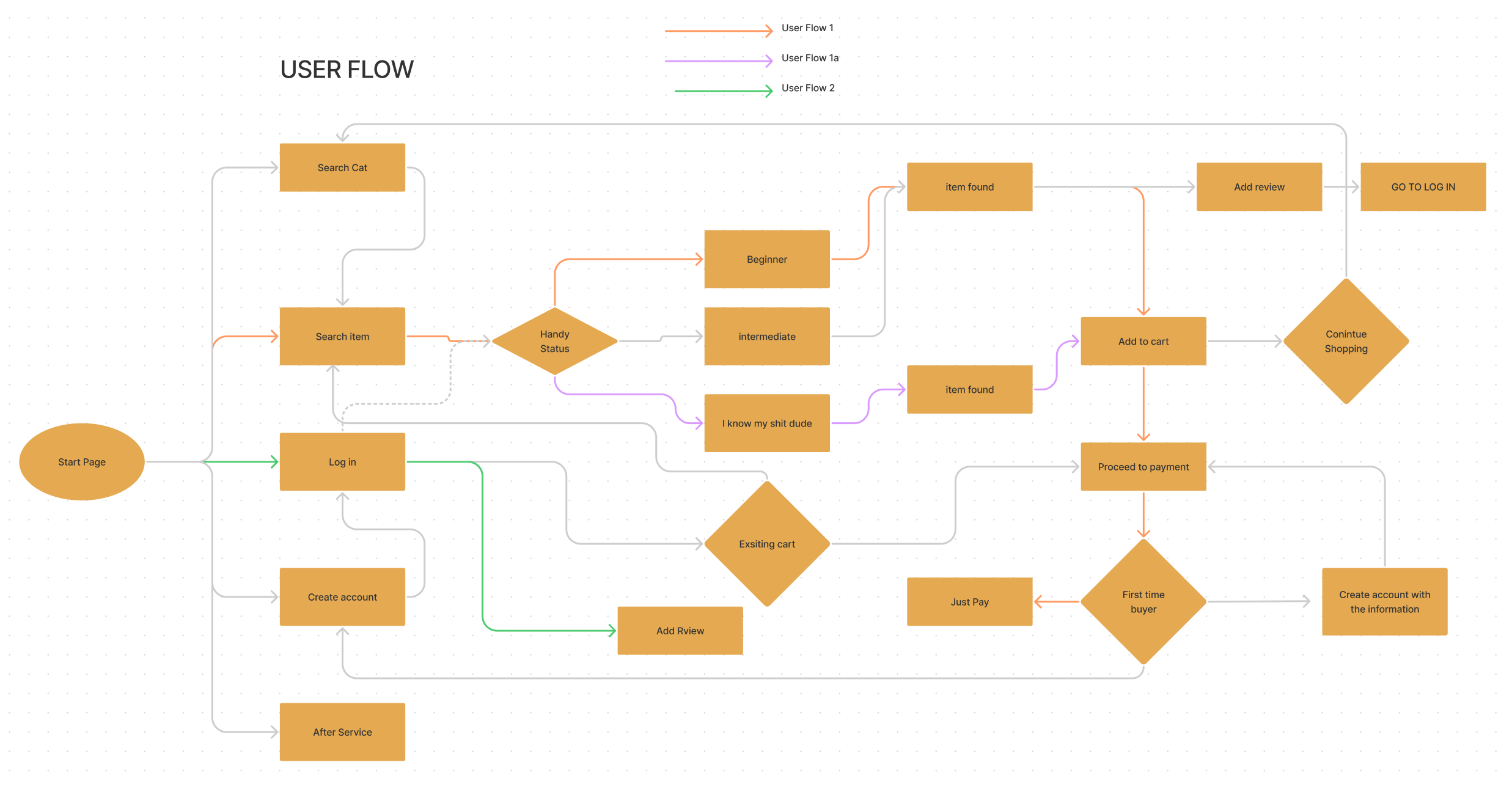
User Flows
As a UX Designer, I began by creating a User Flow based on Competitive/Comparative analysis and affinity mapping, which helped me identify the critical decisions made by the users and the necessary Call-to-action buttons. The User Flow provided the big picture for the prototype, and I used it to build finer details.
Mood Board
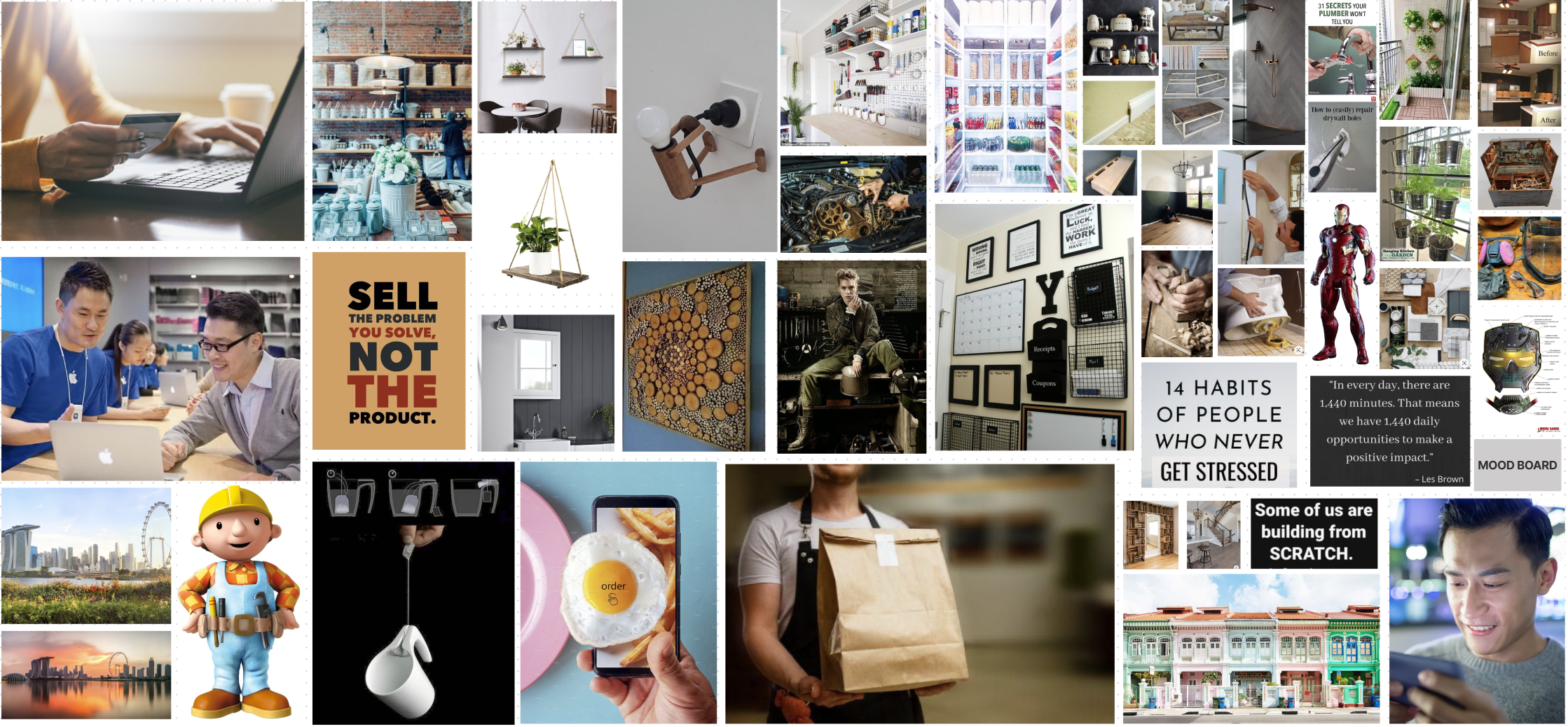
The theme of instant customer service is reflected in the mood board, which aims to emphasize the ease of shopping for hardware, regardless of the user's knowledge level, thus making everyone feel like they can be a repairman.

Some Detailing That Improves Experience
1.Font Selection - As a UX Designer, I selected the style for the website by taking inspiration from the existing design. To complement the brand's image as a hardware store, I chose a Serif font for the text. This typeface conveys a sense of solidity and precision, which are key characteristics for an establishment dealing with tools and equipment.
2. Colour Selection - The website's color scheme was designed with the Horme Hardware logo in mind, utilizing the fixed brown and red colors to create a cohesive and recognizable visual identity.
3.Titles of the page - To reinforce the branding of Horme Hardware, I ensured that the page titles followed a consistent pattern with the logo, using a red underline for the first half of the phrase. This approach aims to create a subtle yet persistent reminder for users that they are browsing the Horme Hardware website.
Prototype
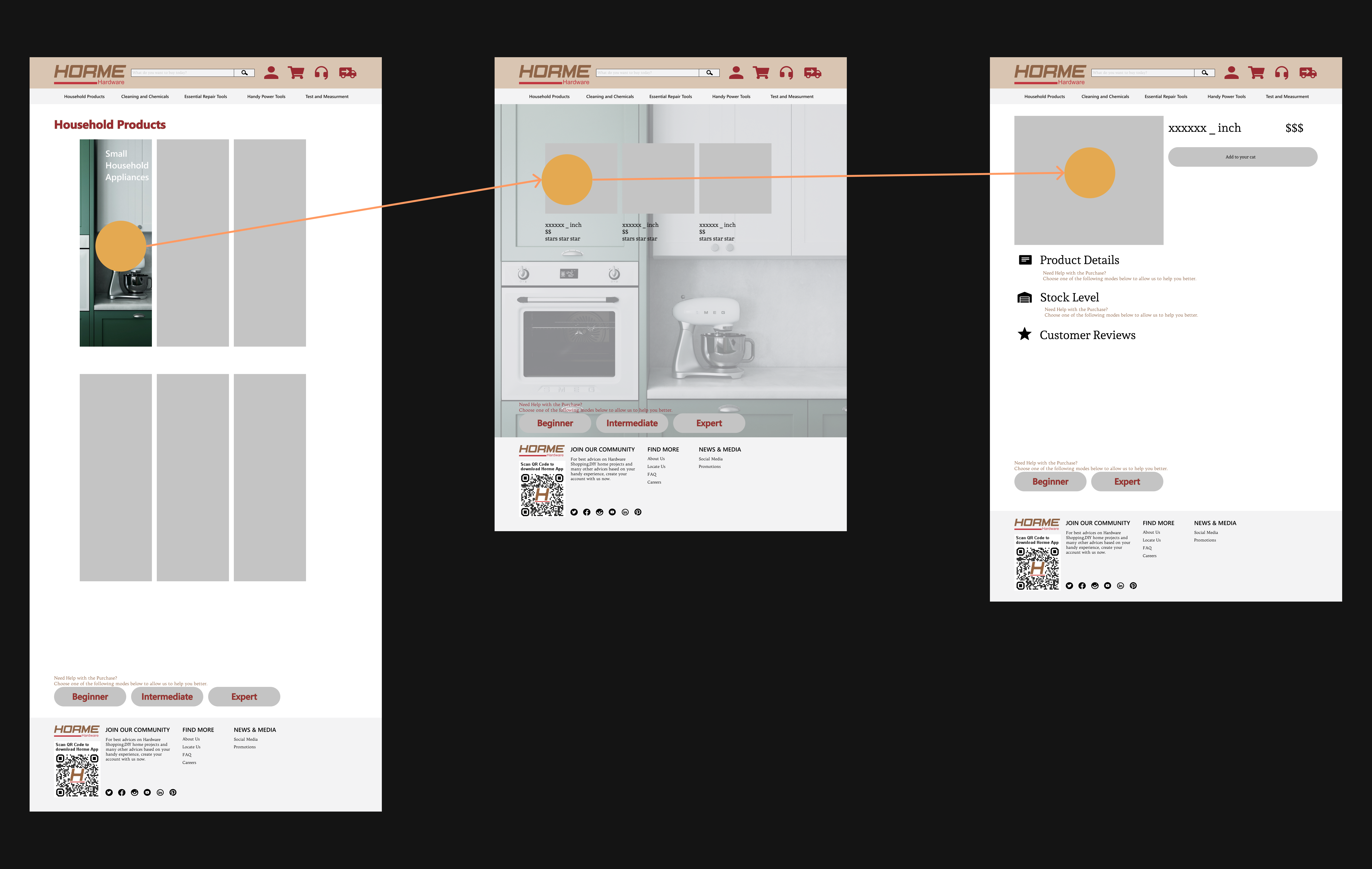
The wireflow in my portfolio serves as a visual representation of the user flow and the structure of the website. It outlines the different screens, interactions, and user actions required to complete the user's goals (how the user reaches the product page). Click the Welcome Banner below to view the prototype
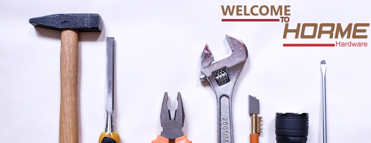
Click the picture ^^ for a working prototype.
User Testing and Re-Iteration
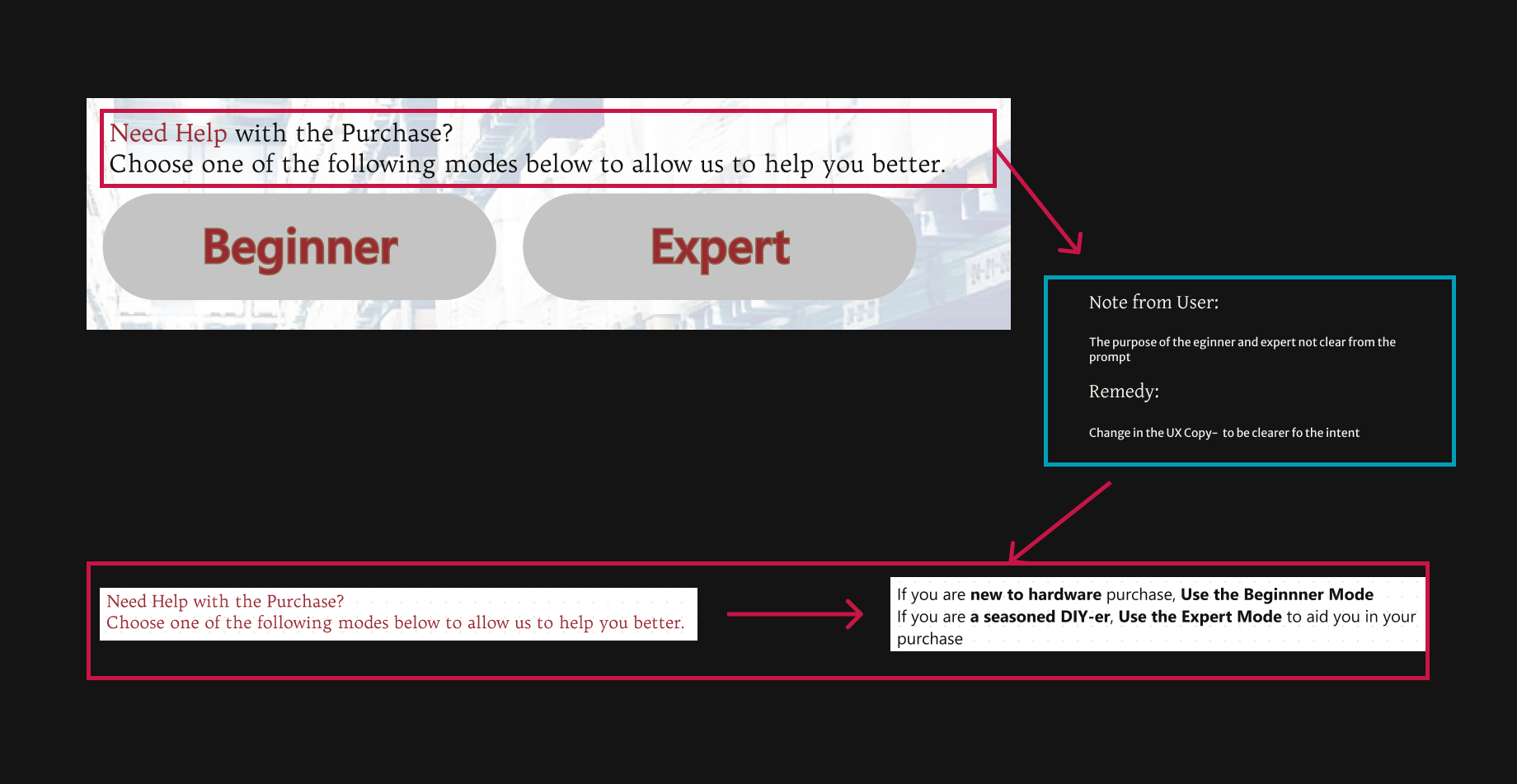
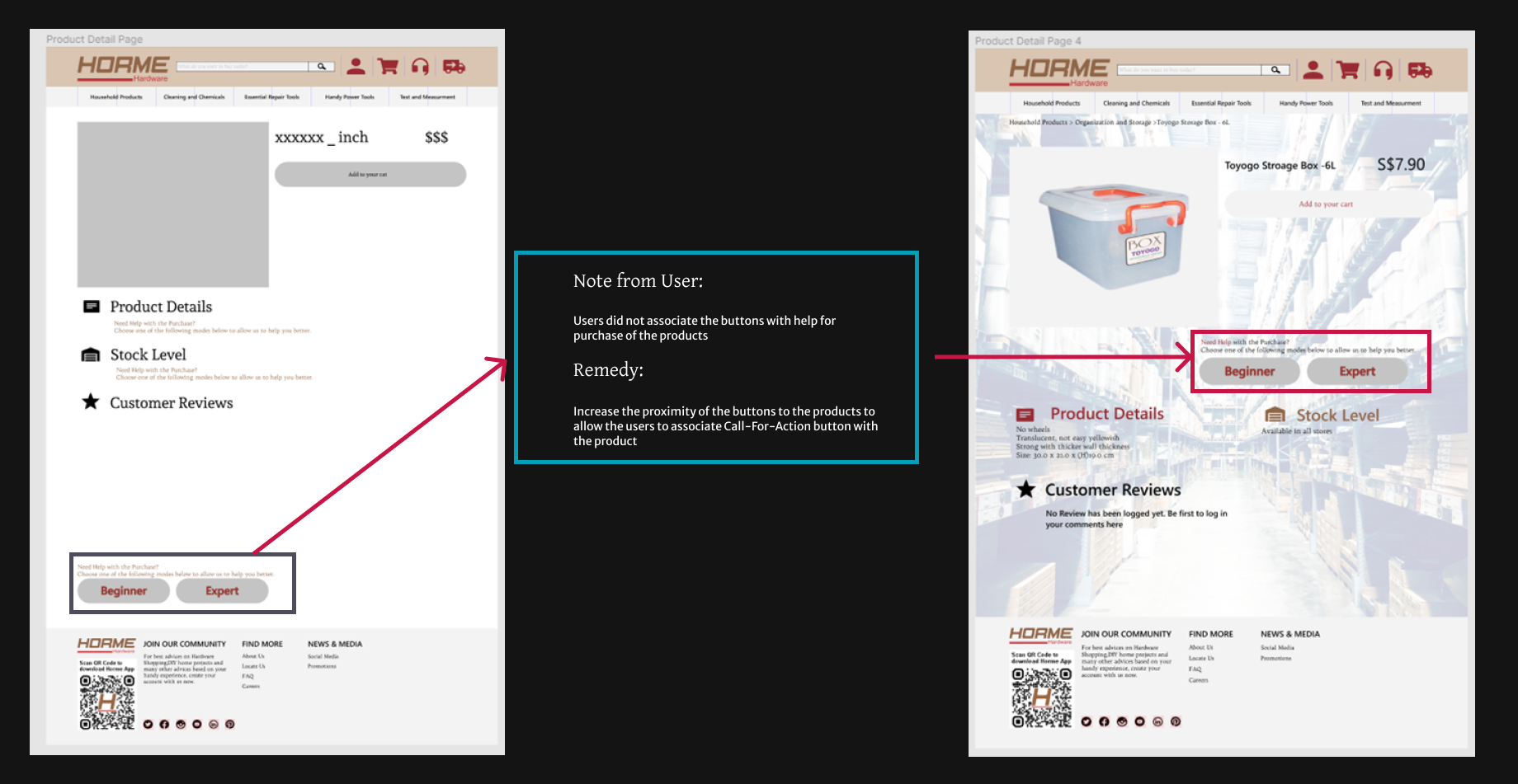
As a UX designer working on a project, I conducted usability tests with four potential users after completing the prototype. The test results revealed that some design changes were needed to reduce the cognitive load on users and make the buttons more intuitive. Consequently, I made the necessary design changes to improve the user experience.
Conclusion
Throughout this project, I have gained valuable insights into both myself and the general design principles of e-commerce websites.
However, there is still room for improvement. For instance, I could have conducted more in-depth interviews to gather more significant data points. This step is crucial during the research phase, as it can help enhance the quality of the prototype and minimize the need for multiple design iterations due to design failure.
Throughout this project, I revisited the User Flow multiple times as I saw the need. However, when I was too deep into the project, it became troublesome as the change in User Flow created a ripple effect affecting other screens. Moving forward, I think I should set a hard stop on the alterations of the User Flow when working on the higher fidelity of the prototypes