Case Study - Grab
Project Brief: Identify an unmet need in Grab as a ride-sharing service and redesign the user experience to solve that need.
Identifying the unmet need
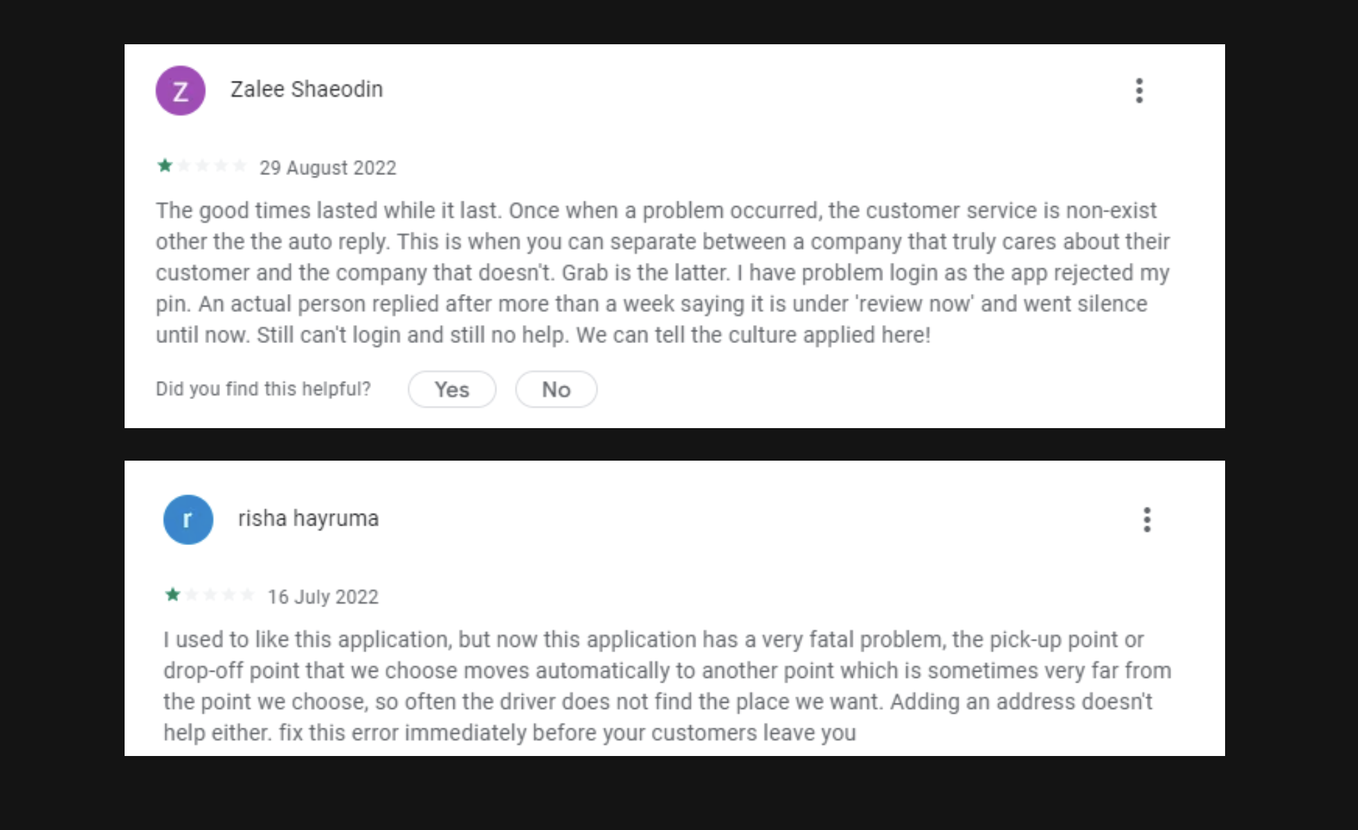
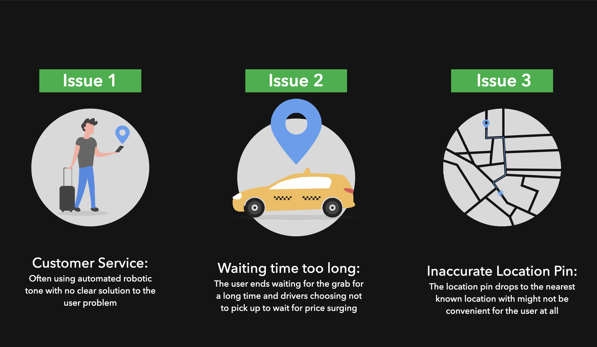
Social Media has such a stronghold in our lives, so I started with the UX Research by scanning the google reviews and forums from June 2022 to September 2022. I also interviewed some of the frequent users of grab (n=3). Three common issues were identified based on the reviews given. With no order of importance, the three issues are listed below.
To understand where grab stands among its competitors in the above issues, a competitor analysis was done.

Meeting the Persona
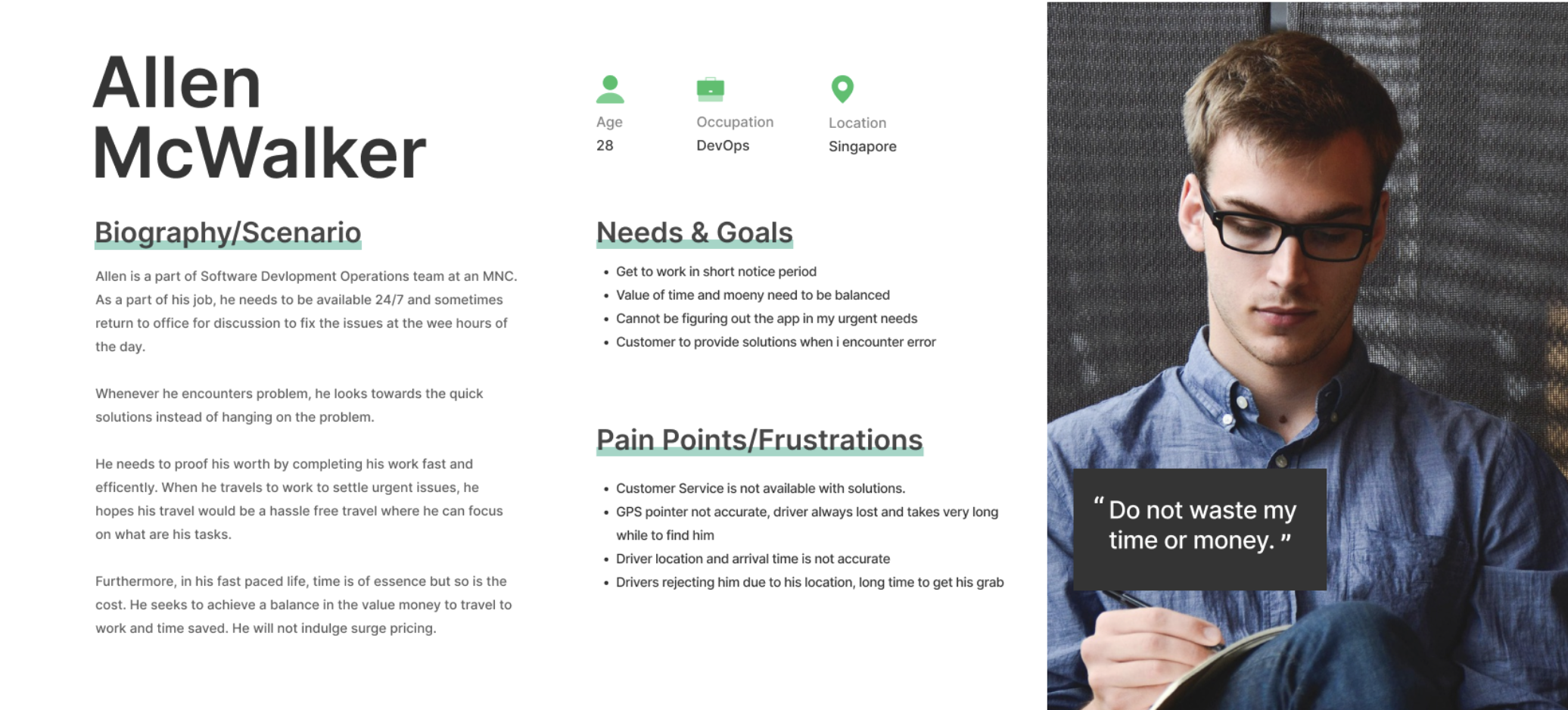
"Do not waste my time or money" was anecdote from one of interviewers and it was very impressionable. It really shows the pain point of the user. How Grab is not putting the customer first and is more catering towards the drivers.
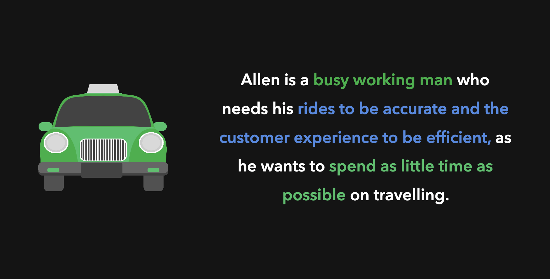
Problem Statement
How Might We
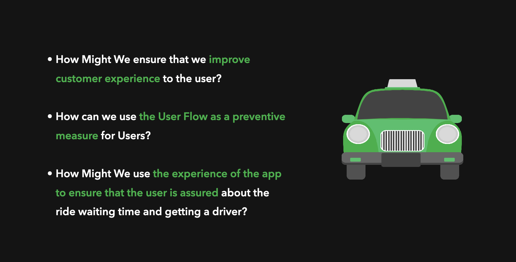
In my perspective, the root of the problem is that Grab as a company is more focused on driver welfare rather than customer welfare. If Grab focuses more on ensuring that the users feel supported in every part of their journey, they will have a more fulfilling experience in the app. This support can be provided with various improvements to the user flow and UI.
Solution 1

The key in this idea is to be bridge between the users and the company, to the customers not feel alone, and they are together in this at every step of the process through changes to the user flow and simple UI changes.
This option is chat bot model where the app is constantly communicating with the User, almost like booking a taxi over the phone.
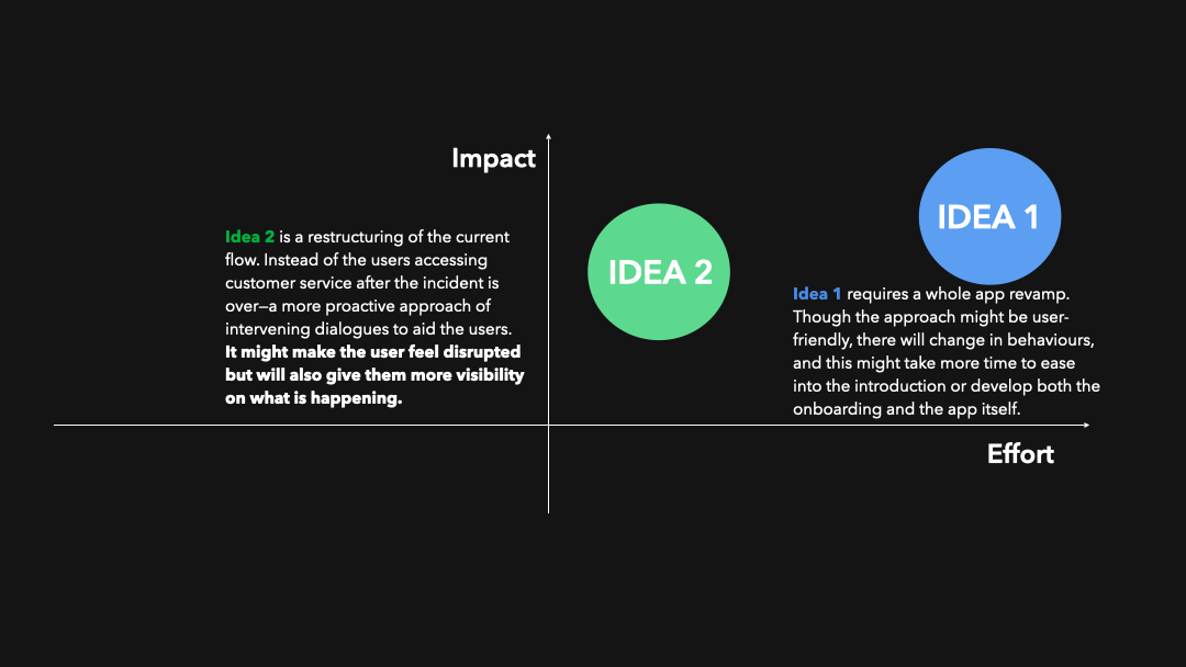
Impact vs Effort
Implementation

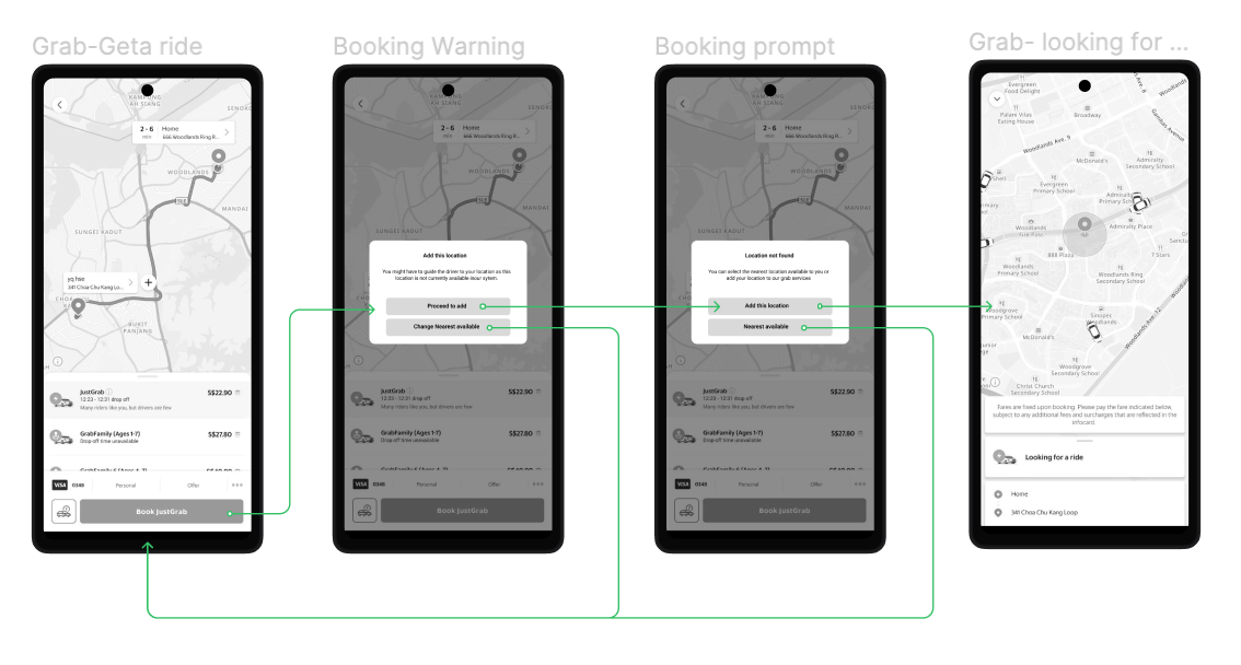
A simple userflow showing the various alternate error paths provided to ensure the customer is going to feel supported throughout the experience.
User Story 1 and how the solution helps
When Allen enters their desired location, which is unavailable, he is given choices to reconsider without the pin moving to the nearest pickup point by itself so that they are aware of what is going on. This will allow him to make an informed decision and feel in control of the situation.
Key Features:
Screen 2 - 1. A pop-up modal is used. They are notified that their location is not found and are given two choices (two Buttons)
Screen 3 - 1. If they choose to add in the location, a pre-empt is given to them to notify them that the driver might be unable to find the location. They can choose again to add or go back to the previous option. Two buttons to display the choices
User Story 2 and how the solution helps
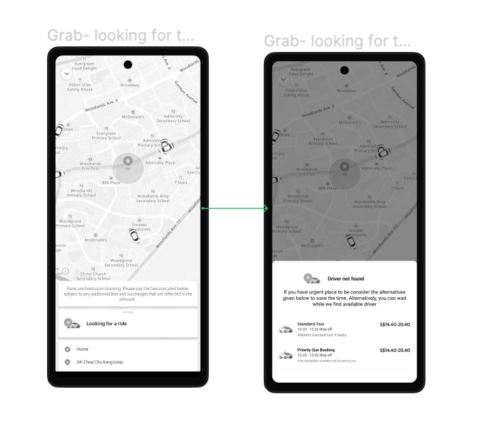
When no one is picking up Allen, instead of frustratingly just waiting for something to happen, he is given alternative choices to consider. This will allow him to consider the options again and if in dire need he can use the Priority Q booking.
By choosing the “Priority Q”, the responsibility is switched to the drivers. If they do not accept the incoming priority q booking, they should be penalized. This prevents the drivers from becoming choosy and will bring up the brand focus back on the users rather than the drivers.
Key Features:
1. While waiting they are given other choices to consider in form of a tapable menu.
2. Slide modal to keep the experience similar to pre booking when the selection of service happens
3. When the user uses priority Q booking, and if the nearby driver does not pick up, the driver will be penalized.
Success Matrix

Conclusion
This case study was done under the time pressure of one day.
Despite the time constraint of completing this case study in just one day, it was a rewarding experience to revise an application that I frequently use and to speak with others who face similar challenges. With more time, I would prioritize Solution 1 and make more significant improvements to the user interface, such as bringing the warning to the forefront rather than keeping it within a modal.